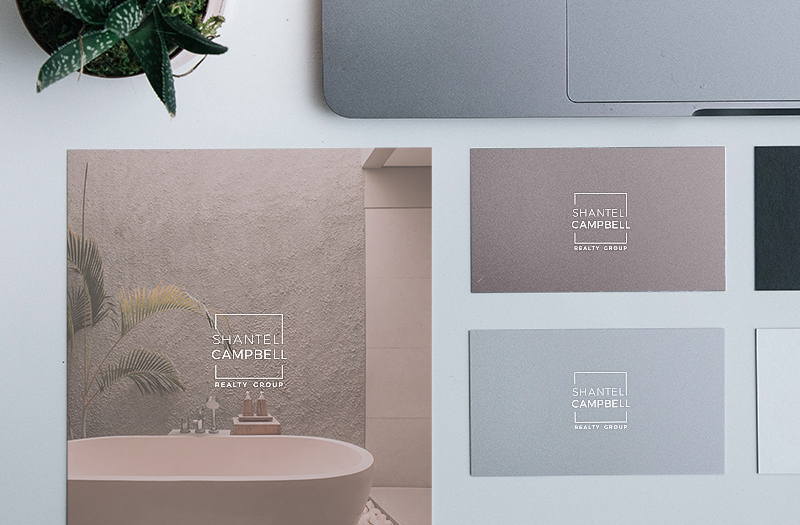
This powerhouse Edmonton Realtor needed a new brand to attract clients and properly represent her business. Her logo and lack of consistent branding was no longer representing the modern, successful real estate company that she had created.
Before
The Logo
The client identifies with modern designs and clean lines. After many different iterations, we landed on this sharp new logo which better portrays her style, and can be easily translated on any medium.
AFTER
Colour Palette
Because her new logo has a somewhat hard look, we decided to contrast it with gentler colours. By selecting a branding colour palette of muted feminine pastels, this softens the look of the logo and represents her softer, feminine side.
#495E6C
#93888C
#E7C3BF
#D0DBE1
#F2F3F4
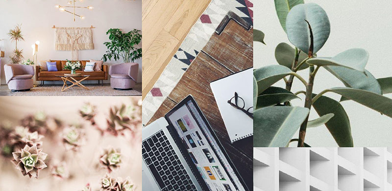
Mood Board
Branding is all about consistency. To ensure all future assets maintained a similar feel, I created a moodboard featuring images of a particular style to either use or draw inspiration from.
With a clear branding style guide that outlines colour palette, typography, and imagery style, it becomes much easier to create consistent products and assets that make your brand clear and memorable.